25+Creative Bedroom Paint Ideas for a Stylish and Modern Look
Paint is the one decision in a bedroom makeover that touches every single surface and affects every other element in the room. Get it wrong and your expensive furniture looks off. Get it right and suddenly a basic room feels like somewhere you genuinely want to be.Most people approach bedroom paint ideas by picking a color they like and hoping for the best. Then they’re standing in a finished room wondering why it looks nothing like the inspiration photo. The color on the wall is right. The bedding matches. But something is flat, something is missing.What’s missing is understanding how paint color interacts with your specific light, your ceiling height, your flooring material, and the psychological effect you’re actually trying to create. This article breaks down twelve real bedroom paint approaches what each one achieves, why it works, and what you actually need to replicate it.
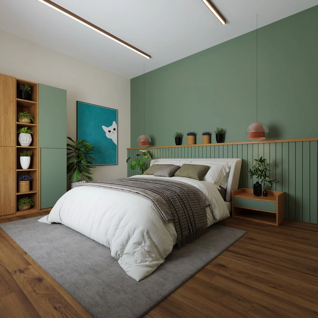
Sage Green Accent Wall: The Color That Works in Almost Every Bedroom Condition

Sage green has become one of the most recommended bedroom colors in the last five years, and it deserves the attention but not for the reason most people think. People assume they love it because it is calming. The real reason it works across such varied rooms is its undertone flexibility.Sage sits at the intersection of grey and green, which means under warm artificial light it reads as a warm earthy tone, and under cool daylight it reads as a fresh botanical hue. It is one of the only paint colors that does not fight its light source it adapts to it. This is why it works in both north-facing rooms with cool indirect light and south-facing rooms flooded with warm afternoon sun.The oak herringbone headboard introduces grain texture against a flat matte wall. Without that textural variation, the wall and headboard read as one undifferentiated surface and the headboard loses definition. Always pair matte walls with furniture that has surface grain, upholstery texture, or carved detail.
Paint to try: Dulux Sage Advice, Farrow & Ball Mizzle, or Benjamin Moore Saybrook Sage.
Plum and Mauve: The Bedroom Color Combination Most Designers Quietly Love

Plum and mauve fall into a category interior designers call chromatic neutrals colors that have enough grey content to function like a neutral backdrop while still providing real warmth and depth. The walls in this room are not a saturated purple. They are a heavily greyed mauve, closer to a warm charcoal with pink undertones than anything you would call bold. Under the diffused natural light from the sheer curtains, it reads as an almost-neutral blush-grey. Under the warm copper lamp light at night, it deepens into a plum that feels genuinely luxurious.That shift between day appearance and night appearance is one of the most underappreciated aspects of bedroom paint selection. Bedrooms are used in both lighting conditions, and most people only test paint chips in daytime light. A mauve or plum with grey undertones performs beautifully in both conditions because its grey content absorbs warmth at night without turning orange, and reflects cool light during the day without turning lavender.
Paint to try: Farrow & Ball Brassica, Little Greene Porphyry Pink, or Benjamin Moore Vintage Wine.
The Warm Neutral Luxury Bedroom: When Beige Is the Bravest Choice

Beige has a reputation problem that it does not deserve. Used incorrectly it is flat, corporate, and lifeless.The specific tone on these walls sits in the warm amber-beige range rather than yellow-beige or grey-beige. This distinction matters enormously. Yellow-beige walls look greenish under certain LED temperatures. Grey-beige walls lose their warmth under diffused daylight and read as institutional. Amber-beige sometimes called honey or caramel beige stays warm under every light source because its warmth comes from red-orange undertones rather than yellow ones.The dark taupe accent panel behind the bed framed by gold trim with a metal ginkgo leaf sculpture is a value shift within the same warm palette. It creates a focal point through depth contrast rather than color contrast. This is an advanced technique: instead of putting a different color behind the bed, you put a deeper version of the existing color. The result is cohesive but not flat.
Paint to try: Sherwin-Williams Accessible Beige, Farrow & Ball String, or Dulux Natural Wicker.
Deep Teal with Wood and Natural Materials: The Color Drenching Approach Done Right

Color drenching painting walls, ceiling, and trim all in the same color is one of the most debated bedroom paint ideas in interior design. Critics say it makes rooms feel smaller. Practitioners know that when executed correctly, it does the opposite: it removes the visual interruption of the ceiling line, making the room feel taller and more enveloping.The critical counterbalance is the linen headboard in natural off-white. In a fully drenched room, you need at least one substantial neutral surface not a small pillow or a lamp shade, but a large furniture piece that provides genuine visual rest. The headboard here covers roughly 40% of the wall behind the bed, which is enough to anchor the composition without interrupting the drenched effect.
Paint to try: Farrow & Ball Inchyra Blue, Benjamin Moore Teal Ocean, or Sherwin-Williams Balsam.
Petrol Blue: The Functional Bedroom That Works as a Study Too

Most bedrooms in modern homes carry double duty sleep space and work space. The paint color you choose needs to support both activities psychologically, and most colors fail at one of the two. Pure navy is too heavy for productive work. Light grey is too flat for restful sleep. Petrol blue a medium-dark teal-blue is one of the few colors that sits in the functional middle.The three blue walls create depth and enclosure behind the work area, which supports concentration. The large window with heavy natural light prevents the room from feeling oppressive. The white and grey bedding communicates rest. The room functions as both because the paint color does not commit exclusively to either mood.The abstract art prints above the bed are in black and cream against the blue, which maximizes contrast and makes the art legible in a way that colored prints would not achieve. On a dark wall, art needs high contrast between the image and its background to remain visually clear.The pegboard in natural wood on the right wall is a deliberate warm interruption in a cool palette. Without it, the entire right side of the room would be flat blue with no material variation. The pegboard’s warm oak tone echoes the natural wood of the desk and the rattan storage baskets below, creating a warm vertical element that prevents the cool walls from reading as cold.
Royal Blue Accent with White: Maximum Impact, Minimum Commitment

One of the most practical bedroom paint ideas for people who want drama without full commitment is the single saturated accent wall against white.
The white adjacent wall is doing something specific: it is not painted white for contrast alone. It makes the blue wall’s saturation appear even richer by comparison, through the same simultaneous contrast principle discussed earlier. If both walls were blue, the overall saturation would feel normalized. Against white, the blue wall reads as deeply saturated.The nightstand is dark espresso wood — a warm dark tone rather than black. Against a saturated blue wall, true black furniture creates a harsh edge. Dark brown wood softens the transition while still providing enough value contrast to remain visually distinct. The texture of the wood grain against the flat matte paint is what creates definition.
Sage Green With Tropical Mural: When Paint Becomes Architecture

The sage green on the surrounding walls is intentionally quiet, almost institutional in its muted flatness, so that the backlit mural niche reads as the entire personality of the room.This creates a stage lighting effect: the backlit frame draws the eye inward and illuminates the mural from behind, making the botanical illustration appear to glow rather than sit flat on a surface.The teal velvet channel-stitched headboard in front of the mural continues the green-blue palette from wall into furniture without repeating the same tone. Teal is brighter and more saturated than the sage walls, which gives the headboard visual priority while staying in the same color family.Block print bedding in green and white ties the botanical theme of the mural into the horizontal plane of the bed. This is what transforms a pretty wall into a fully cohesive bedroom concept: the mural theme is echoed in the textiles.
Blush Rose: Understanding Why Warm Pink Works in Bedrooms

Dusty rose the version of pink with significant grey and red-brown content functions psychologically in bedrooms the same way warm neutrals do, but with an additional quality: it creates what color researchers call warmth without energy. Pure warm colors like orange and red are energizing. Pink with grey content provides warmth but suppresses the arousing quality, making it appropriate for rest.The cream and light wood furniture against these walls maintains warmth without introducing contrast. Every element stays in the warm spectrum rose walls, cream furniture, taupe-grey bedding, warm-toned oil painting. The only interruption is the grey-purple in the bedding, which is a cool accent that prevents the all-warm palette from feeling overly sweet.The draped curtains in the same rose family as the walls are a deliberate tonal continuation. When curtains match the wall color in value if not exactly in hue, the window stops looking like a hole in the wall and becomes part of the overall composition.
Color Drenching in Emerald: The Collector’s Bedroom

This is the most advanced bedroom paint approach in this article because it requires the highest commitment and offers the least margin for error and it delivers a result no other technique achieves.The emerald green here is paint-drenched across walls and ceiling, but what makes it work is the herringbone oak floor. This is the essential principle of successful dark-wall rooms: the floor must be warm-toned and natural. A dark wall room with a cool grey floor reads as oppressive because there is no warmth below the eye line. A dark wall room with warm oak or walnut flooring reads as enveloping and rich because the floor provides the warmth that the walls absorb.The gallery wall of varied-size frames, art, and objects creates a layer of content at mid-wall height that prevents the large expanse of green from feeling like an undifferentiated dark mass. This is the technique collectors have used for centuries in libraries and studies: on dark walls, objects and art become surface texture, not just decoration.
Warm Sand and Luxury Lighting: The Hotel Suite in Your Own Home

This room demonstrates something that most bedroom paint guides never address: the relationship between paint color and ceiling material.Remove the wooden ceiling and replace it with white painted plaster, and these same walls would look pale and flat. The ceiling material is amplifying the wall color by providing a continuous warm overhead surface that reflects warmth back downward into the room.The curved cream seating in front of the bed introduces a furniture form the rounded sofa section and round ottoman that echoes the arch shapes in the wall panel. When furniture form echoes architectural detail, the room feels like it was designed as a whole rather than furnished from a catalogue.
Yellow and Teal: Triadic Color Theory for Bedrooms
Yellow bedrooms fail most often because the yellow chosen is too saturated.The green bed frame and the teal accent chair are both in the yellow-green-blue family, creating a triadic color relationship with the yellow walls. Triadic colors three hues spaced equally on the color wheel create energy and dynamism when used correctly, which is why this room feels playful and alive in a way that analogous or monochromatic rooms do not.The floral print curtains are carrying multiple colors from the room’s palette simultaneously green, teal, gold, white which allows them to serve as a visual bridge between all three triadic colors. In rooms with multiple distinct colors, a patterned textile that contains all of them is the most reliable way to achieve cohesion.
What Bedroom Paint Decisions Most People Get Wrong
The most common mistake is choosing a paint color from a small chip card under artificial store lighting and expecting it to look the same on four walls of a bedroom under completely different light conditions. A chip that looks like a soft grey under fluorescent retail light may read as blue-green on your south-facing wall at 3pm.Always test with a minimum sized painted swatch on the actual wall. Observe it at three times of day morning, midday, and evening with your artificial lights on. Only after seeing all three conditions should you commit.
FAQ
What is the best paint finish for bedroom walls?
Matte or eggshell. Matte hides imperfections and has no glare. Eggshell is slightly more washable while still being low-sheen.
Should bedroom walls all be the same color?
Not necessarily. A single accent wall in a deeper or contrasting color behind the bed is often more effective than four identical walls, particularly in smaller rooms where full-color commitment can feel heavy.
How do I know if my room needs warm or cool paint tones?
Look at your flooring and fixed elements. Warm wood floors, brass fixtures, or beige tiles need warm-toned paint. Grey floors, chrome fixtures, or white tiles pair better with cool or neutral-cool wall colors.
Does dark paint really make a room feel smaller?
Only when the lighting is insufficient. Dark walls in well-lit rooms feel intimate and dramatic, not small. Dark walls in poorly lit rooms feel oppressive.
Conclusion
Every paint choice in this article is solving a specific problem too much light, not enough warmth, a room used for both sleep and work, a space that needs to feel luxurious on a limited budget. The most useful thing you can take away is that bedroom paint ideas work when they are matched to a room’s actual conditions and your actual daily habits, not just to an aesthetic mood board.Test your shortlisted colors in real light. Understand what undertone does to your existing fixed elements. And if a color makes you feel something real when you walk into a room not just “that looks nice in the photo” but an actual physical response of relaxation or warmth that is the right color for your bedroom.